Timeline
September – February 2024
Services
- Branding
- Logo
- Color
- Font
Client / Brief
The Dundee Community Committee is a non-profit organization whose purpose is to provide resources and activities that benefit children and families, while fostering a sense of community.
The group wanted a modern rebrand for the organization. The final logo would be used on the committee’s socials and printed onto shirts.
Process - Typography & Color
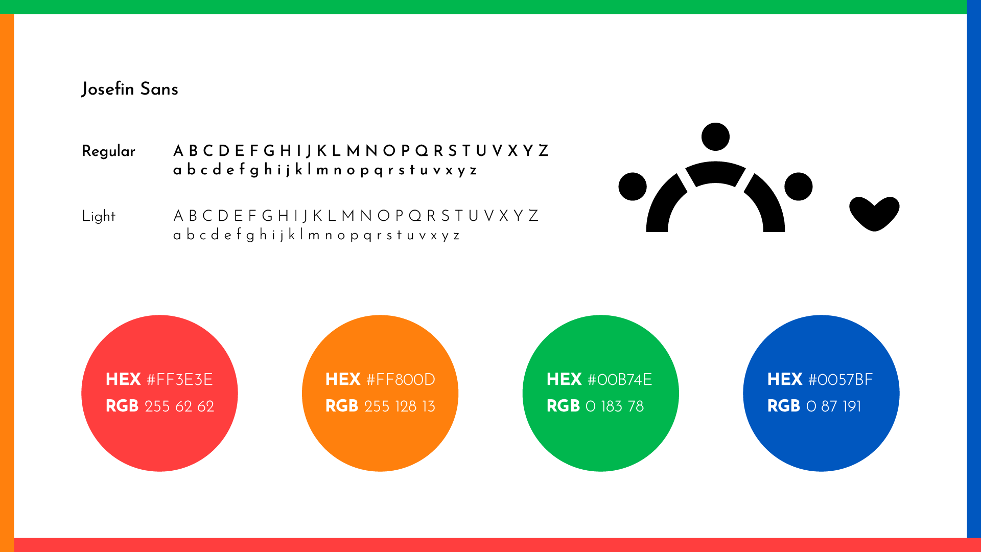
The sans serif nature of Josefin Sans, along with its tilted “e”’s and rounded characters convey warmth and friendliness and feels more modern.
Sketches & Drafts
Shape and color psychology play a big role to communicate goodwill and neighborliness. So while all the drafts have distinct silhouettes, they all use a vibrant color palette and focus on curved and personified shapes.
Even if it ultimately wasn’t chosen, I am proud of how I was able to form the group’s initials into a cohesive logo. The “people” linking arms can also be interpreted as chains linked together, conveying strength and connection. This is further bolstered by the use of primary colors.
Challenges
My biggest challenge was coming up with something unique that still tied back to the organization. The final design fits well because it captures “people” coming together with the half circle. The configuration also looks like a sunrise, with the purposefully imperfect heart emphasizing the human element and warmth of the committee. Paired with the use of multiple sequential colors off the color wheel, the composition communicates a sense of unity and harmony.


