An advanced electronics design and prototyping contractor.
The client wanted a simple logo for use on his PCB designs.
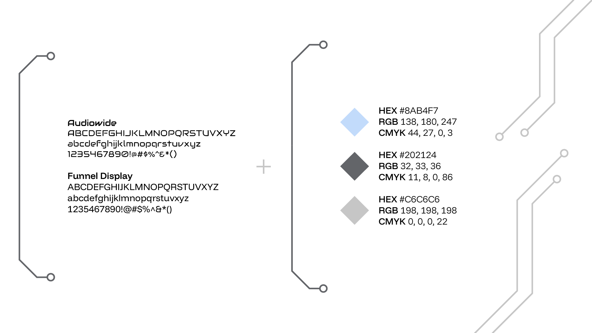
Fonts
Audiowide is a sleek, techy font that reflects the client’s expertise and personality through its rounded angular edges which resemble circuitry. Because this font is highly stylized however, it should only be used for titles and headings.
The sans serif Funnel Display is unique with its pixel-like embellishments on letters like d, n, and r, and horizontal lines on letters like f, t, and y. It is a modern, legible font suitable for copy.
Colors
The color palette is understated with a cool blue and some neutral grays that convey professionalism, reliability, and intelligence.
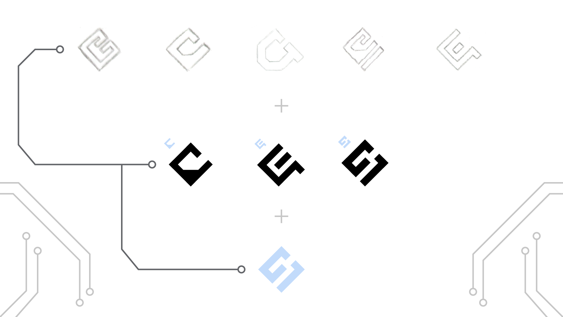
Logo Concepts + Challenges
Originally, I wanted to incorporate the company’s initials, GES, into the design, making the logo more meaningful and memorable. But over time, I figured that focusing on the “G” was most important as it was the first letter of my client’s last name. It was challenging to ideate so many iterations of these letters, especially ones that combined all of them into a cohesive logo. In the end, I utilized thick lines of the same weight and negative spaces of the same width to illustrate precision and stability, communicating the quality of my client’s work.
Final Logo
Given that this logo would be etched onto printed circuit boards, I had to make sure it was simple, distinct, and legible from a distance. I stuck to a more geometric look with straight lines and sharp corners that aligned with my client’s industry as well as referenced PCB components. When etched, the logo would only be in one color, so I kept to a singular color and a clean shape.