Timeline
March – September 2024
Services
- Branding
- Logo
- Color
Client / Brief
The Strategic Economic Development Foundation, Inc. was organized to provide educational programming related to business operations for underserved populations beginning in the mid-Willamette Valley area of Oregon. It is a separate entity from, but still related to, SEDCOR, the Strategic Economic Development Corporation.
Design a logo for the Strategic Economic Development Foundation, Inc. The SEDF logo should be distinct from SEDCOR’s, but still fit the identity of a corporate start-up that aids community businesses.
Process - Color & Typography
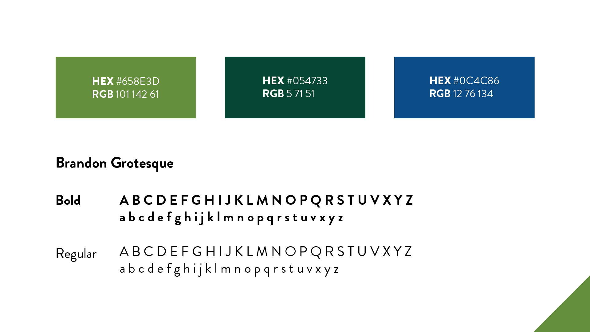
SEDCOR’s font, Brandon Grotesque, should be used for SEDF materials. I reused the SEDCOR color palette, adding an additional darker green for the base of the “tree”. These colors not only tie SEDF back to SEDCOR, they connote renewal and reliability. As you look up, there is a sense of lightness and movement as the colors change with the upward arrows
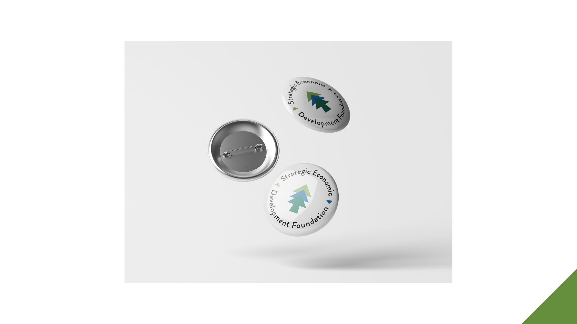
Because SEDF is a branch of SEDCOR, I experimented more with a geometric look, using straight lines and sharp angles. These elements signify stability, fitting for a foundation that bolsters businesses.
Additionally, the repetition of shapes encapsulate the ideas of growth, development, and community. The tree imagery relays strength and legacy while also referencing the Pacific Northwest.
Challenges
A big challenge during the course of this project was turning the broad and abstract concepts that make up SEDF into a simple mark. Words like development, sustaining, and community were difficult to express and merge as they all had their own unique visual concepts. But given the request to incorporate tree imagery as SEDCOR and SEDF reside in the Pacific Northwest, an idea presented itself. Those key words, along with many others provided by SEDF, can all be represented by repetition. Repeated elements can symbolize growth, innovation, and prosperity as they build off one another. The silhouette of a pine tree exemplifies this principle. When broken down into simple upward triangles, it represents progress.
Another challenging aspect was choosing the color palette for this new logo. I ultimately decided to reuse the colors of SEDCOR as the two organizations are related to and work with each other. The logo’s lined up shapes have enough room for just the two SEDCOR colors to be used without overlapping, but it looks less dynamic this way. Because SEDCOR’s colors are natural and darker, it wouldn’t make sense to introduce a brighter one. Instead, I changed the base of the logo to a darker shade of the green. This adds movement while still making the blue stand out and appearing SEDCOR-adjacent.


