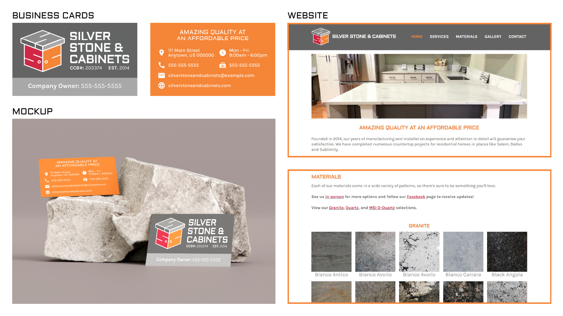
A small countertop and cabinet manufacturing and installation company based in Salem, OR. They are a well-established, local, and family-owned business with a large portfolio of completed projects. Branding should project reliability and sturdiness.
Branding materials will be used on print and social media such as business cards and Facebook.
Fonts / Colors
I picked a sans serif font with a blocky look to project a sense of stability, trustworthiness, and seriousness.
Logo Process
Because this is a local family business, I wanted to pay homage to the client’s Chinese heritage by including a red and an orange in the color palette.
These colors add contrast amongst the various lines and sections. Additionally, the colors add energy into the logo and represent passion, confidence, and strength.
The logo incorporates the initials of the company into a stone countertop and cabinetry form that creates a distinct silhouette.